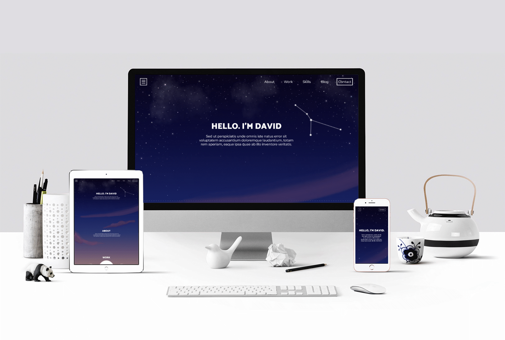
Concept
The
Idea
David expressed that he wanted his personal site to reflect his love of hiking and the outdoors.
The idea is to map a hiking scene along one long continuous page as opposed to a landing page that leads to several other unique pages.
There will still be a menu bar, but instead of going to a whole new page, it just scrolls down quickly to the corresponding section.
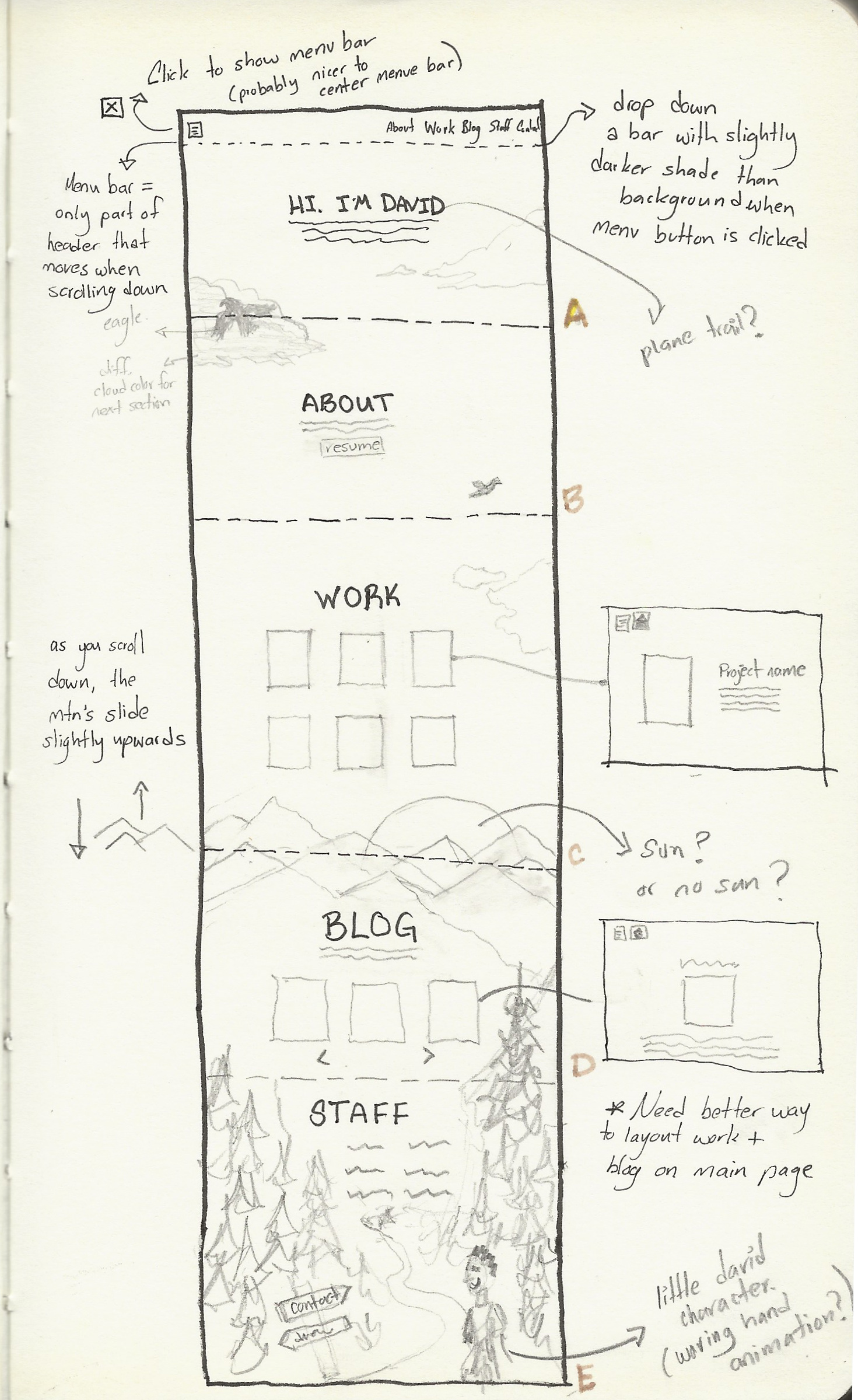
Sketchbook
Color
Scheme
Precedents
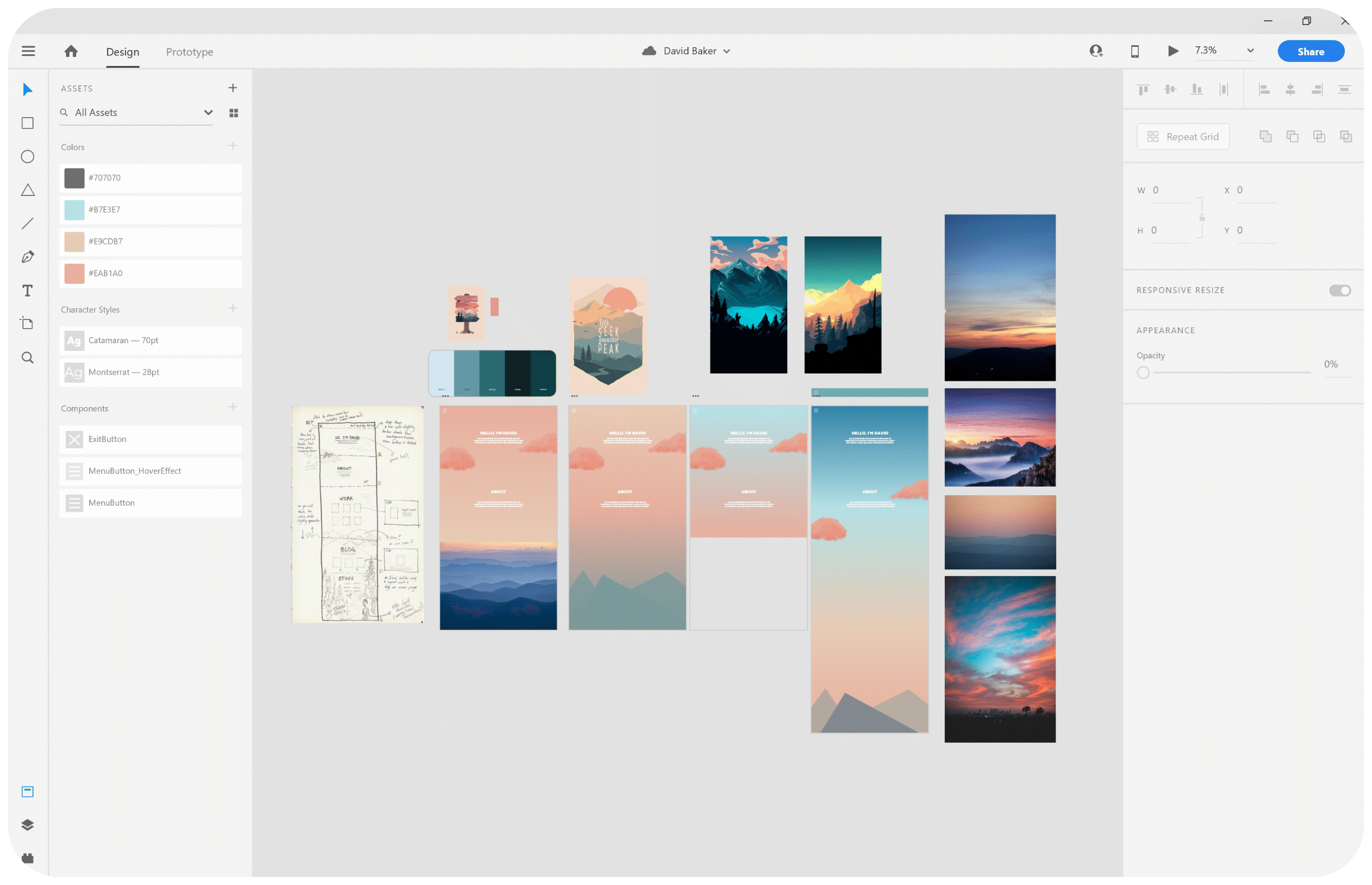
The first inspirational image above is an example of a backdrop that utilizes different shades of one color vs the second image which uses two colors. The third picture uses complementary colors, which I personally like the most but I don't think it reflects David's personality.
The fourth image I feel is a good compromise between all the options. I would make the last part with the trees green though.
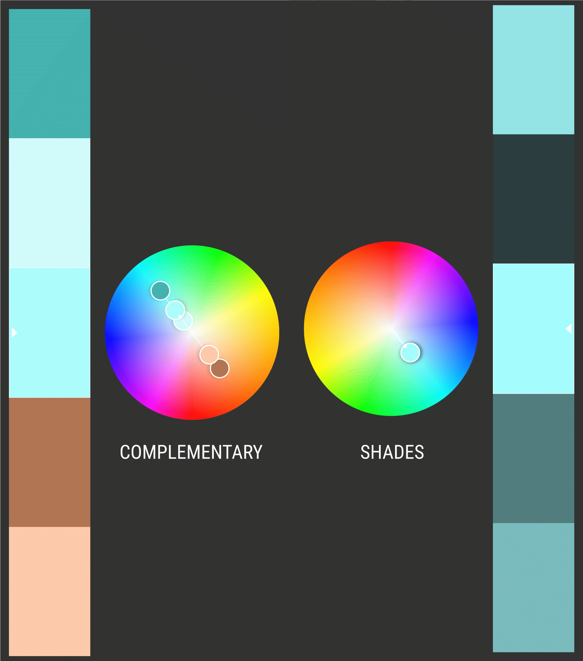
Color
Scheme
I considered making the website just shades of blue/green that David likes, but I feel like it would be too boring. Also it would be difficult to get that layered effect with the mountains and trees with just one color scheme. A complementary color scheme would be much more interesting.
In my first digital iterations below , I didn't think that salmon color of the sky in the landing page reflected David's personality. (His favorite colors are 'stormy blue' and 'forest green).
Because his site visitors will spend the most time on Work (section C), and Blog (section D), I wanted the latter part of the site to also reflect his personality and preferences. The idea is to inject the color blue when the mountains appear under the Work section and end the page with a green forest and path.
Web
Sections
Landing
Screen
Looking at sunsets, I noticed that you can sometimes see the stars at the top of the sky. I decided to incorporate that element into the landing page.

Skills
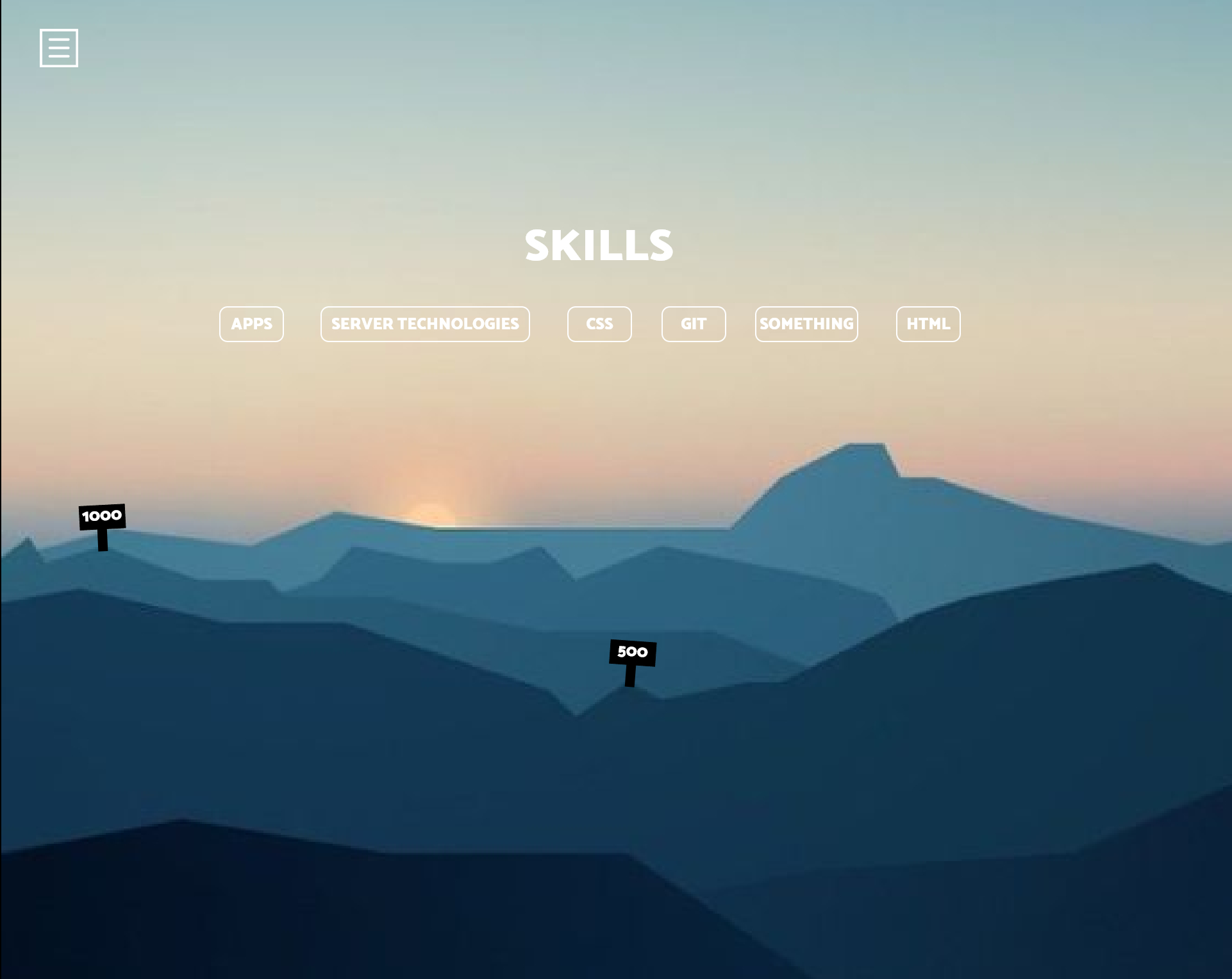
I wanted to showcase David's skillset along the mountain section of the scene.
I am currently experimenting with a different ways in which the elevation markers can respond to each skill.
When the visitor hovers over a particular skill, he/she can gauge how proficient David is at the skill via how high the elevation mark would read.
Sketchbook
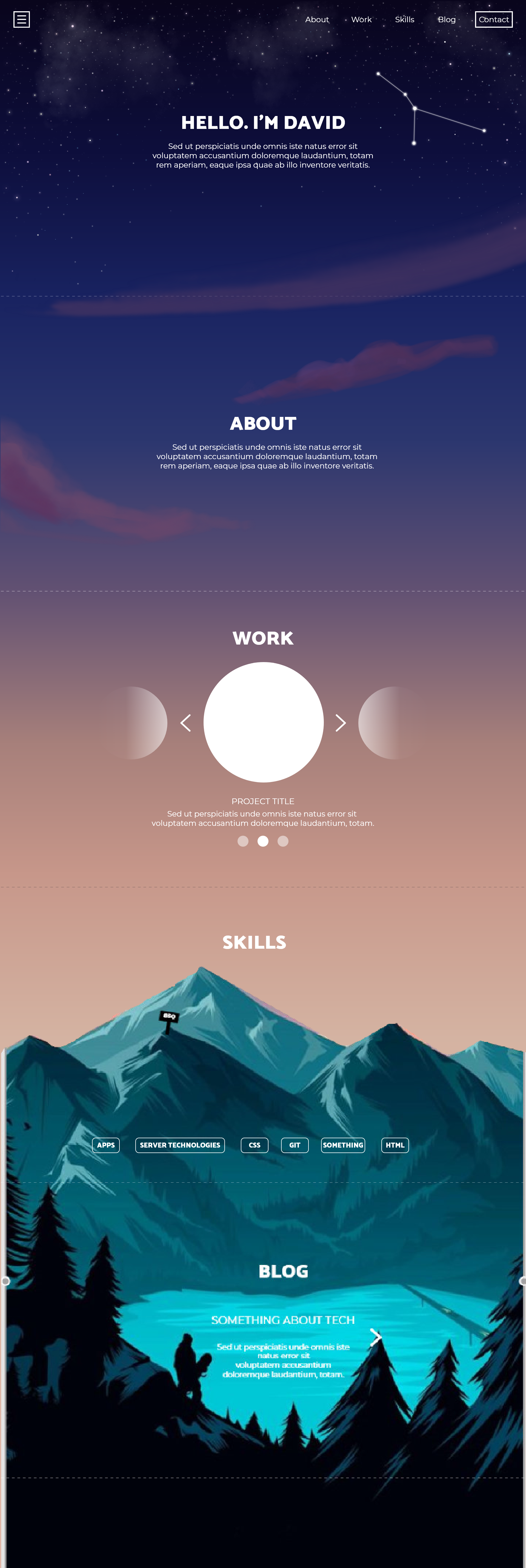
Below is a snapshot of the work-in-progress.
Work-in-Progress Snapshot

