The
Problem
As someone who hates food waste, I always try to use everything I buy from the grocery store before it expires. But being as busy as I am and with limited culinary experience, it doesn’t usually go too well. I still find myself having to throw out those green beans that sat in the back of the fridge for too long. Or ruining an entire entree by insisting on putting in that wilted brown cilantro I didn’t have the heart to throw out.
The Larger
Implications
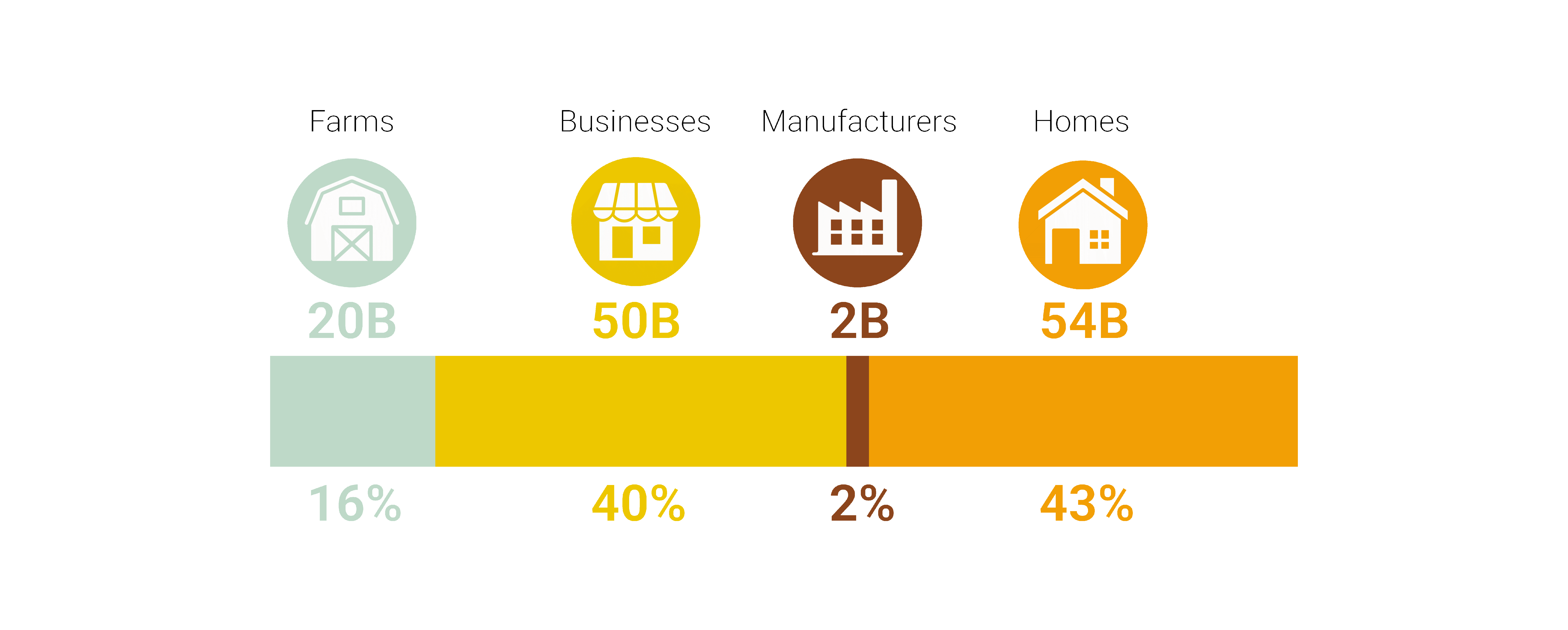
Looking at the problem on a larger scale, in the United States, food waste is estimated at between 30-40 percent of the food supply.
The best approach to reducing food loss and waste is not to create it in the first place. Waste can be avoided by improving cooking methods from the consumer level.

The goal of this project was to design a hands free application that would help users find recipes that use up the ingredients they already have at home and reduce food waste.
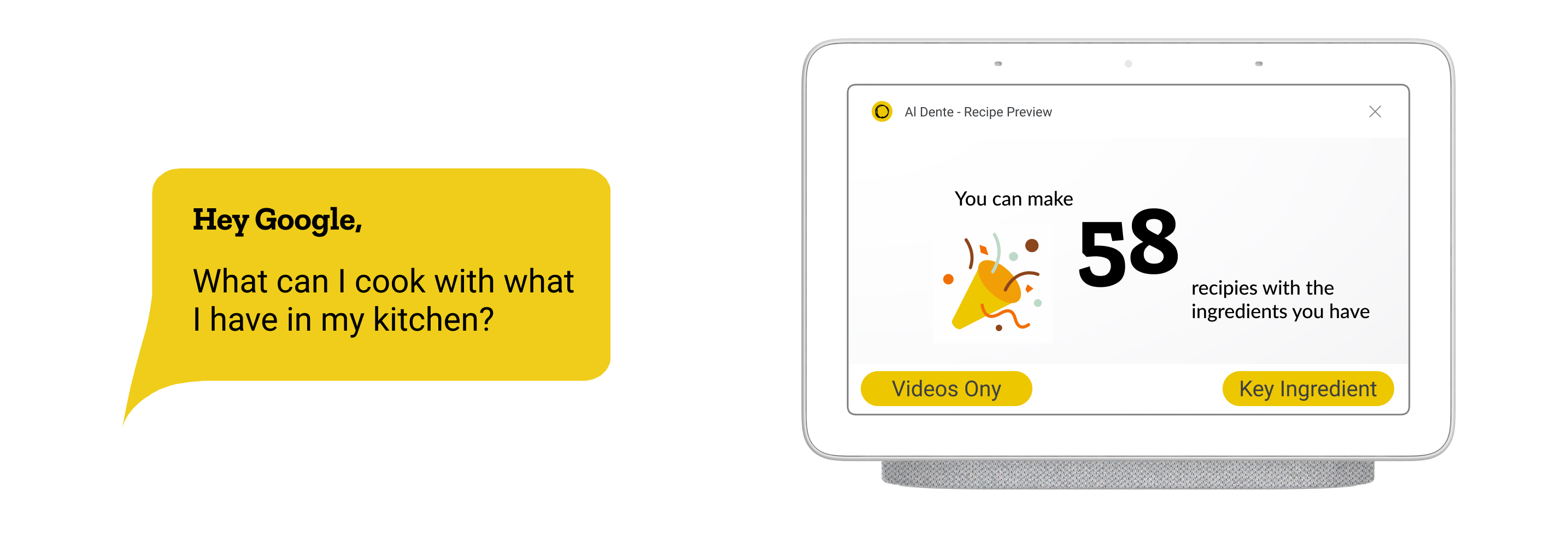
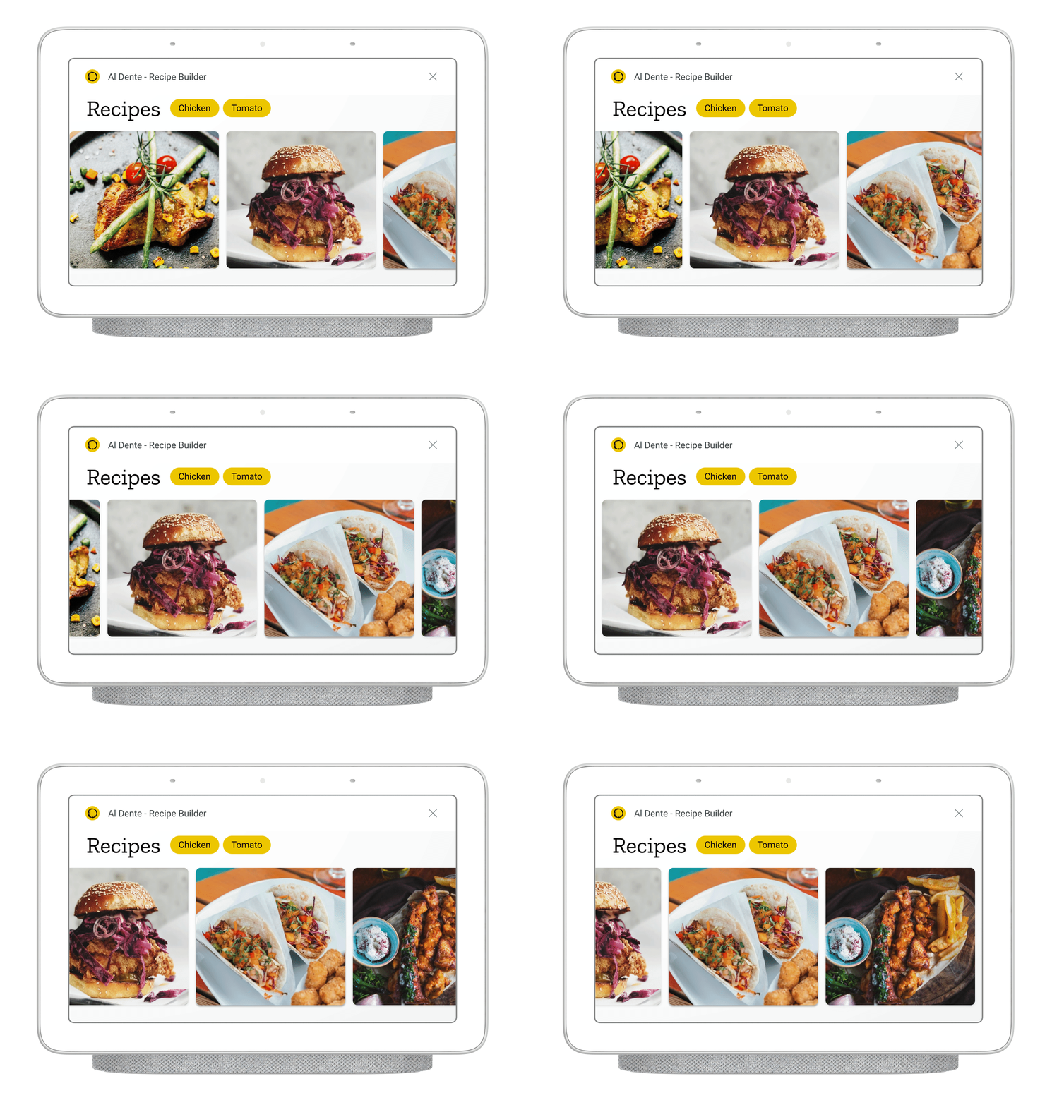
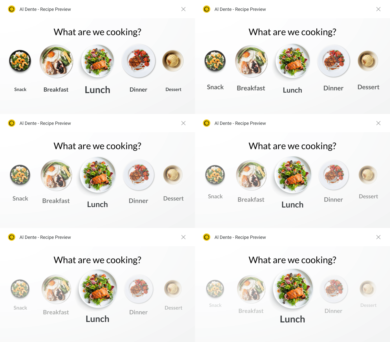
Al Dente recipe preview
Conversation
Modeling
The
'Happy Flow'
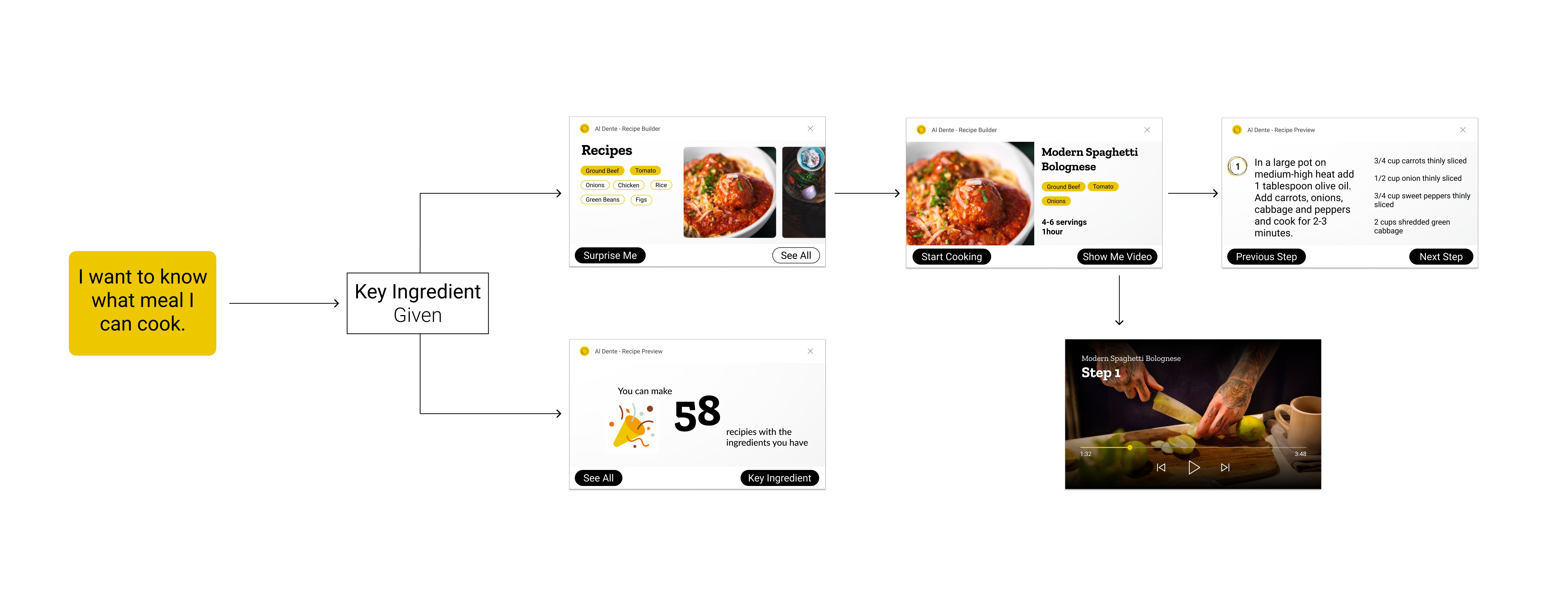
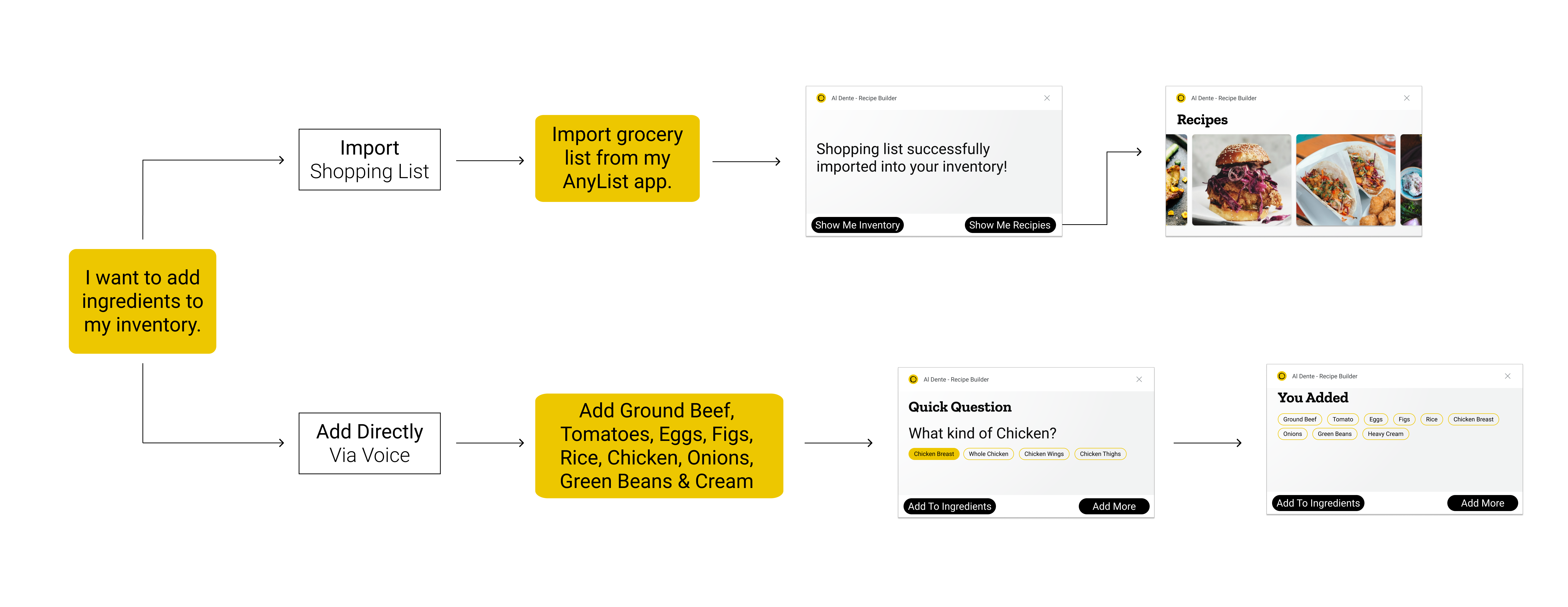
I first modeled a complete conversation for the ‘happy paths’, e.i., the paths in which the user reaches the ideal outcome in the least number of steps.
This step also helped me determine variables required from the user to fulfill the request.
Research
To further understand the problem I decided to start with a heuristic evaluation of current applications that offer similar services.

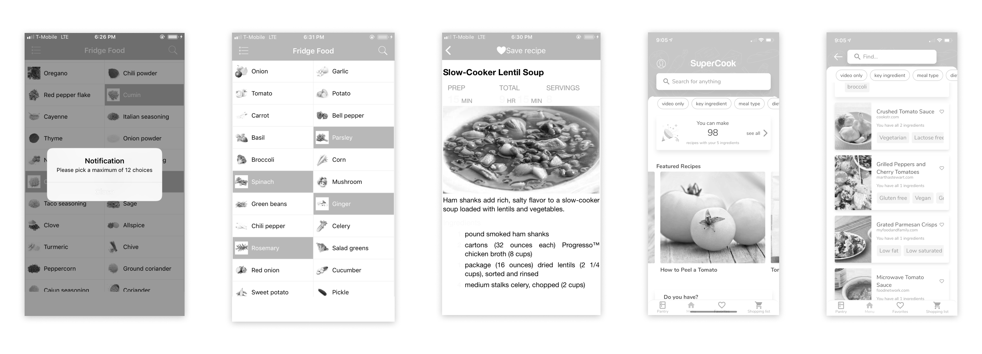
Web and mobile apps offering similar solutions
Functionality
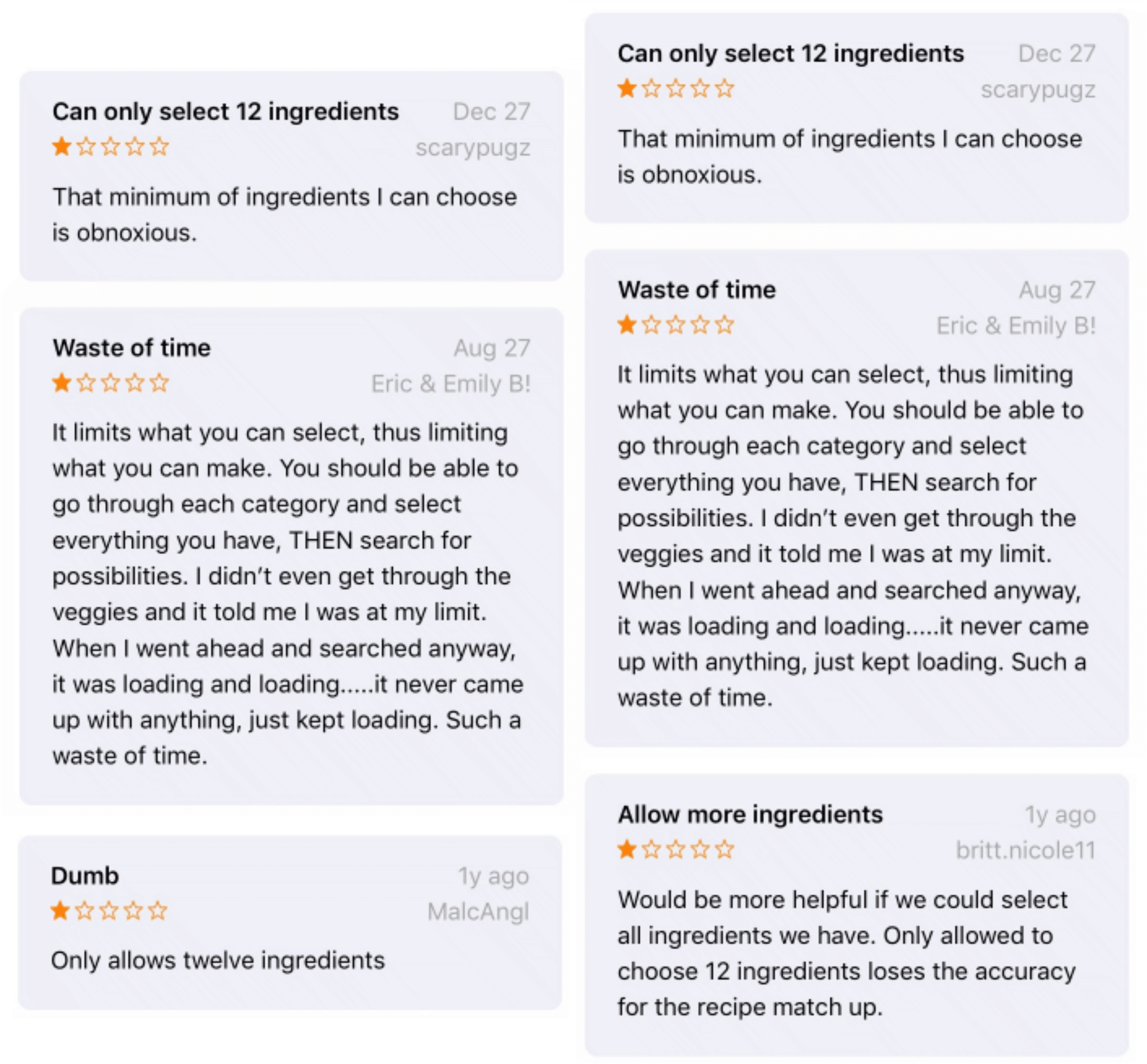
A common thread of complaints was that there was a cap to the number of ingredients the user can enter. In addition, the applications seemed to only accept broad, commonly used items and lacked the capability to accept specialty ingredients.
Process
Contextual Testing
Testing out optimal font
size and layout
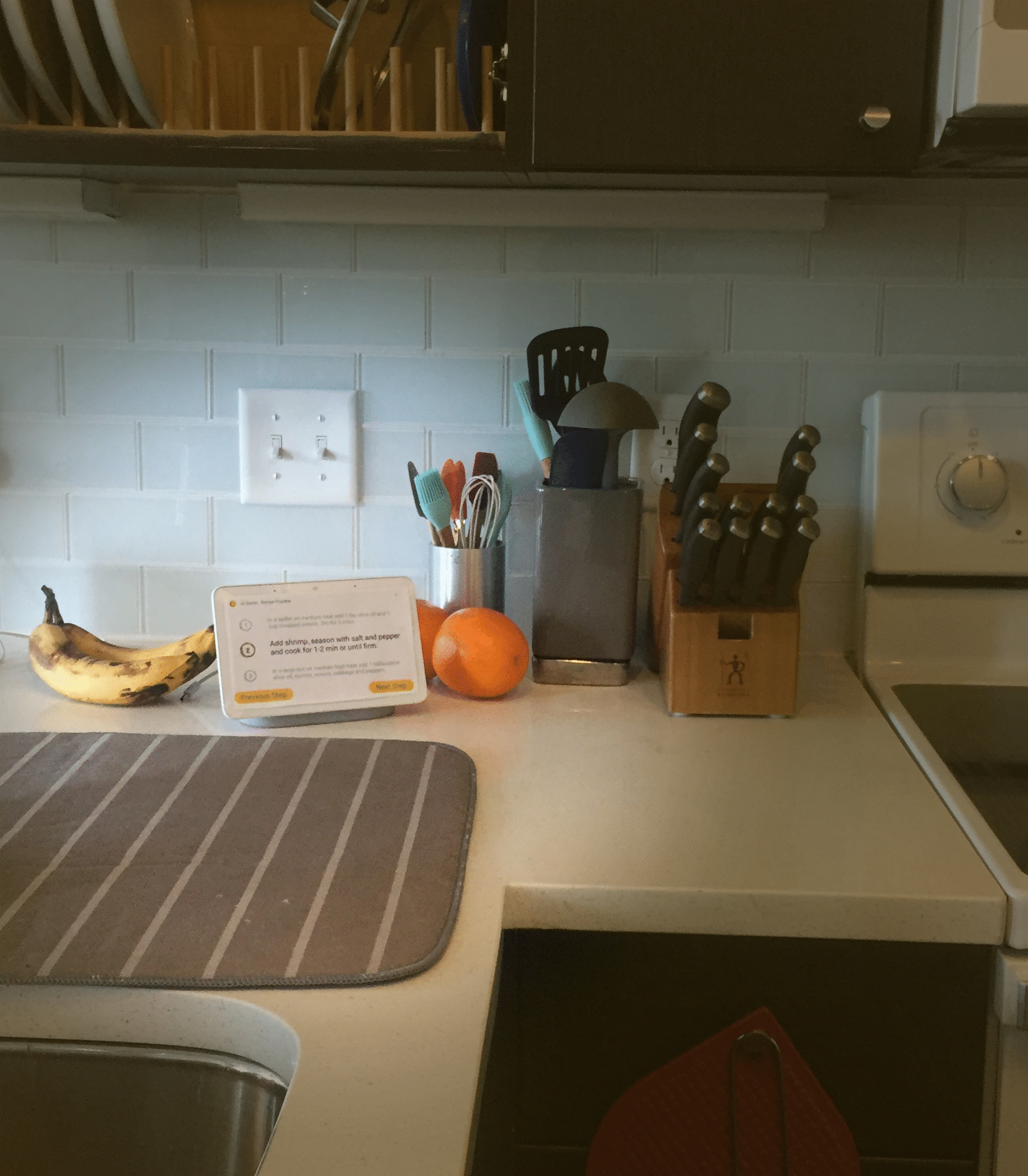
In order to determine the right size and layout for the recipe instructions I printed out my iterations.
I then carefully taped the cards to a Google Home Hub display and had my users walk around the kitchen to test the legibility and give me feedback.

Testing different sizes and layouts for recipe instructions
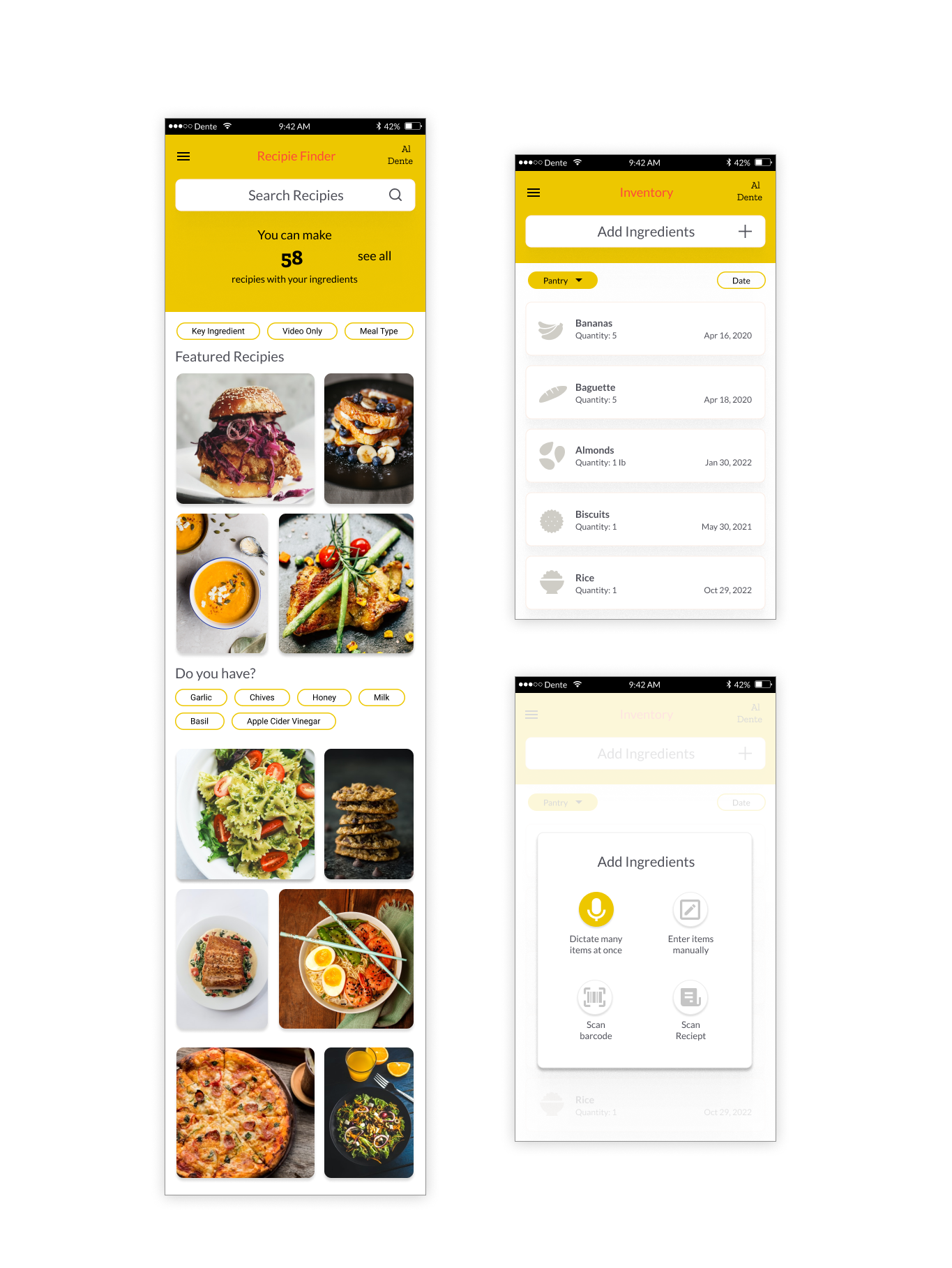
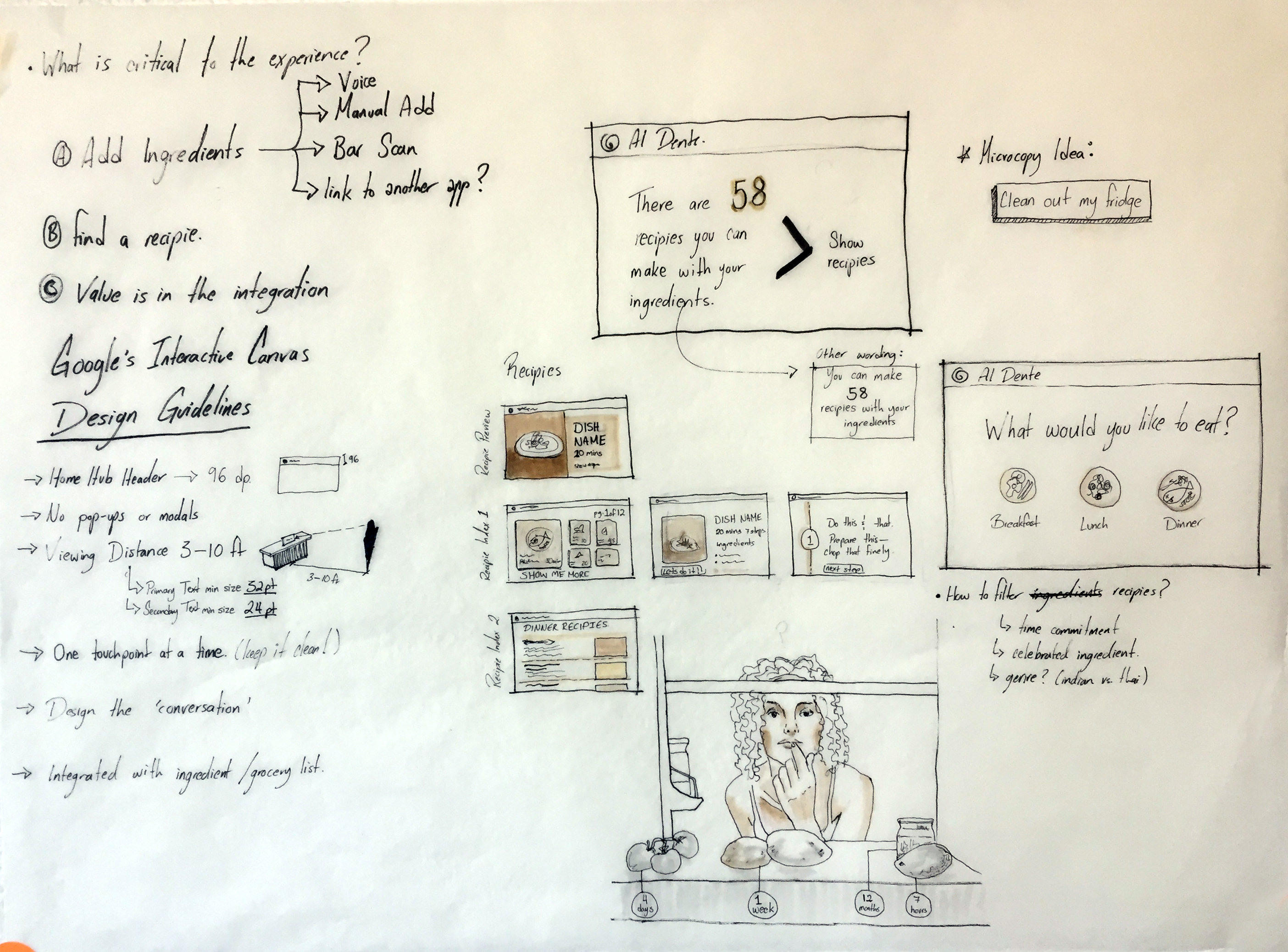
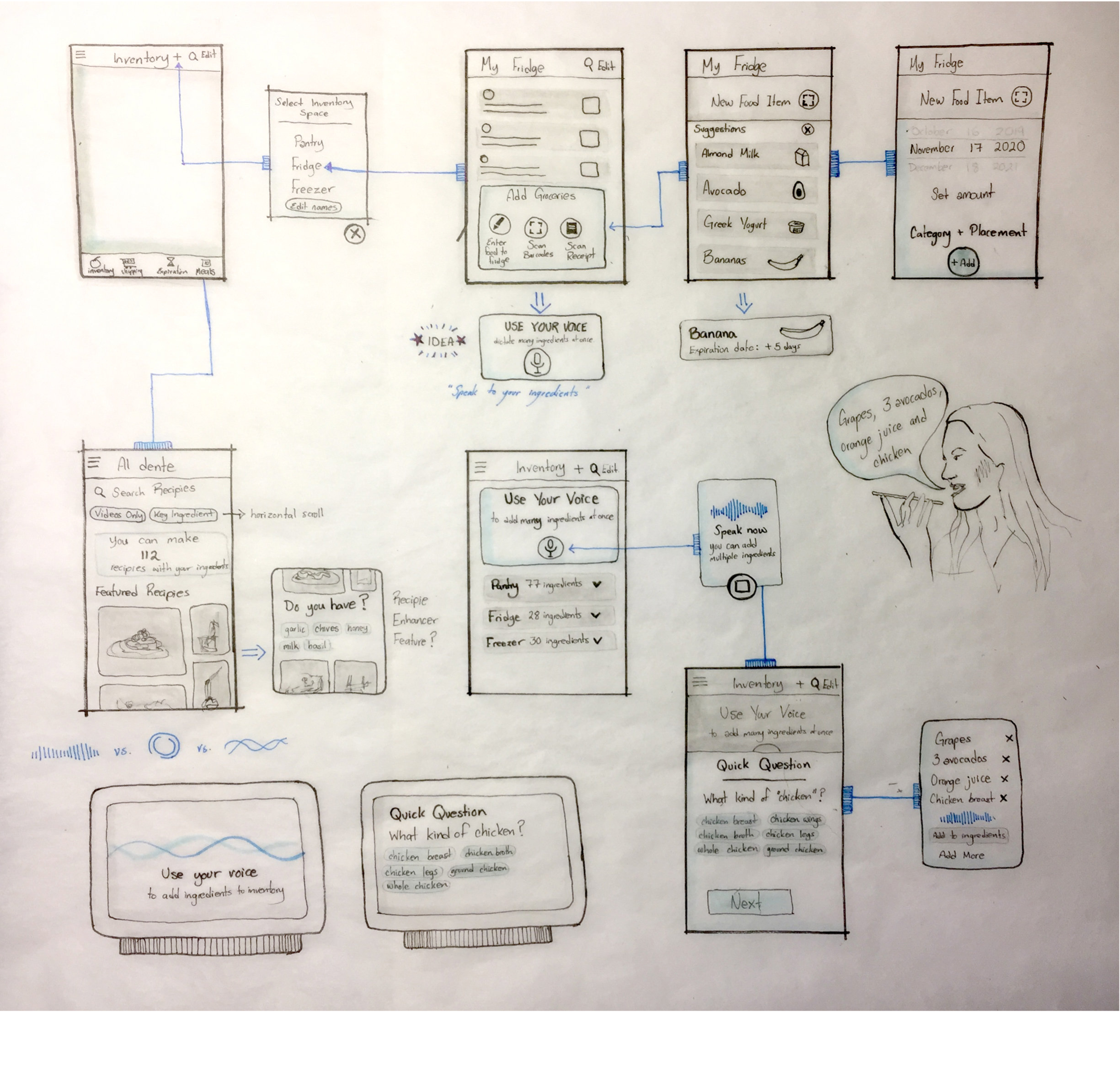
Before the high def wireframes, I had sketched out low def wireframes shown below. Due to the restrictions on how one would use the google hub, the ability to integrate a phone app was taken into consideration, especially when it comes to adding ingredients onto the application's inventory.
High-Fidelity
Mobile Wireframe
Mobile was not studied as thoroughly as the Google-hub interface, but I developed key screens to demonstrate the integration of the app with the home device.
